Role - UX Designer | Timeline - 8 weeks | Dashboard design, App design
OvervieW
Protecting Lives, Simplifying Insurance
GLOBAL BENEFIT SOLUTIONS makes it easy for employees to manage their insurance benefits. With a simple app and dashboard, users can view their coverage, enroll online, track claims, and access wellness resources anytime, anywhere—keeping them informed and in control of their health and insurance benefits.
challenge
-
Users find it difficult to manage their insurance benefits, track claims, and navigate complex features in existing insurance apps.
-
The lack of an intuitive and consolidated dashboard leads to frustration, delayed claim tracking, and a generally poor user experience.
-
The challenge was to design a dashboard that enables users to easily manage their insurance benefits, track claims, access wellness resources, and stay updated on their coverage, all in a simple, easy-to-navigate interface.
how did we solve it?
We designed an intuitive and user-friendly insurance dashboard that consolidated all necessary features in one place. The dashboard allows users to:
-
Quickly check their insurance coverage details.
-
Track claim statuses in real time.
-
Access wellness resources and updates.
-
Complete enrollments and make changes online.
The design focuses on keeping things clear, simple to navigate, and making sure users can get the information they need when they need it.
Insights
-
How would you describe the preferred visual style or aesthetic for the new dashboard? Are there any specific design elements or branding considerations that should be incorporated?
-
What are the primary goals you aim to achieve with the insurance dashboard?
-
What features or functionalities do you believe are critical for the success of the dashboard?
-
What are the main pain points or challenges users currently face while insuring themselves?
-
What is your vision for the insurance dashboard?
-
What are the primary business objectives you aim to achieve through this design?
Interview Questions
Stakeholder Interview
Understanding Stakeholder Perspectives: Gain insights into the goals, expectations, and requirements of key stakeholders involved in the insurance dashboard design.
Step 1 - Discovery Phase
-
The goal is to create a simple, user-friendly insurance dashboard that improves customer satisfaction, engagement, and internal efficiency, with key features like real-time claim tracking, easy access to coverage details, and seamless enrollment.
-
The dashboard should have a clean, modern design that aligns with the brand identity, addresses user pain points, and supports business objectives like improving retention and streamlining processes.

User Persona
.png)
Understanding User Needs and Preferences: Gather insights into the needs, preferences, and pain points of users interacting with the insurance dashboard.
User Research

UX Design Process
Following a Design Process ensured that the end result was user-centered, met project goals, and led to better collaboration and more efficient decision-making.
Insights
-
Need for Simplicity: Users demand a step-by-step enrollment flow that simplifies decision-making and eliminates confusion.
-
Personalized Wellness: Wellness resources should be tailored to individual health goals, ensuring relevance and higher engagement.
-
Wellness Integration: Wellness resources are valued but need to be personalized to individual health goals and coverage plans to increase engagement.
-
AI and Personalization: AI-powered chatbots can provide real-time guidance, making enrollment and wellness navigation easier.
-
Mobile-First Approach: A seamless mobile experience is essential, as most users prefer managing their insurance on-the-go.
We created an easy-to-use insurance dashboard that brings everything users need into one place. The dashboard lets users:
-
Quickly check their insurance coverage details.
-
Track claim statuses in real time.
-
Access wellness resources and updates.
-
Complete enrollments and make changes online.
I reduced cognitive overload by decluttering pages and organizing content into smaller, manageable sections, allowing users to focus on their tasks without distractions.
how did we solve it?
Role - UX Designer | Timeline - 8 weeks | Dashboard design, App design
OvervieW
Protecting Lives, Simplifying Insurance
GLOBAL BENEFIT SOLUTIONS makes it easy for employees to manage their insurance benefits. With a simple app and dashboard, users can view their coverage, enroll online, track claims, and access wellness resources anytime, anywhere—keeping them informed and in control of their health and insurance benefits.
-
The old design had a cluttered layout, making it hard for users to find what they needed quickly.
-
Users were frustrated with slow loading, confusing features, and felt the platform didn’t meet their needs.
-
Too much information on one page overwhelmed users, making it tough to focus on important tasks.
challenge with the Old design

Design Process
Following a Design Process ensured that the end result was user-centered, met project goals, and led to better collaboration and more efficient decision-making.
Step 1 - Discovery Phase
Stakeholder Interview
We had detailed conversations with stakeholders to understand their goals, expectations, and challenges. Their insights helped shape the design, ensuring it aligns with their needs, business objectives, and user expectations for a more effective and user-friendly solution.
Interview Questions
-
What are the primary goals you aim to achieve with the insurance dashboard?
-
What features or functionalities do you believe are critical for the success of the dashboard?
-
What are the main pain points or challenges users currently face while insuring themselves?
-
What is your vision for the insurance dashboard?
-
What are the primary business objectives you aim to achieve through this design?
-
How would you describe the preferred visual style or aesthetic for the new dashboard? Are there any specific design elements or branding considerations that should be incorporated?
Insights
-
The goal is to create a simple, user-friendly insurance dashboard that improves customer satisfaction, engagement, and internal efficiency, with key features like real-time claim tracking, easy access to coverage details, and seamless enrollment.
-
The dashboard should have a clean, modern design that aligns with the brand identity, addresses user pain points, and supports business objectives like improving retention and streamlining processes.
User Research
User research helped us gather insights into the needs, preferences, and challenges of users interacting with the insurance dashboard. This ensured that the design was tailored to enhance their experience and effectively address their concerns.
User Persona
.png)

Secondary Research
Industry Reports and Insights
Market Trends
The digital insurance market is growing rapidly, with more users opting for mobile apps to enroll in plans, manage policies, and access wellness benefits. A report by Deloitte states that 60% of users prefer digital platforms for their insurance needs. This shift highlights the need for seamless, intuitive user experiences in insurance applications.
Research by Capgemini shows that users prefer simple, easy-to-follow enrollment processes, but many find existing insurance apps too complex. The lack of transparency and wellness personalization is a major pain point, leading to low engagement with health benefits.
Consumer Behaviour
Insights
New technologies like AI-powered chatbots are transforming digital insurance by providing real-time assistance during enrollment. Many users struggle with selecting the right coverage, and AI can help by answering questions, guiding users through the process, and offering personalized wellness suggestions.
Emerging Technologies
Competitor Research

Insights
-
Strengths
-
Clean, minimalist design.
-
Easy to navigate.
-
Ideal for users seeking straightforward insurance management.
-
-
Weaknesses
-
Does not integrate wellness features.
-
Limited appeal for users looking for a more holistic approach.
-

-
Strengths
-
Offers a wide range of products.
-
Ideal for users wanting to compare different policies.
-
-
Weaknesses
-
Cluttered user interface.
-
Overwhelming amount of information.
-
Not optimized for users solely managing existing policies.
-


-
Strengths
-
Holistic approach with integrated wellness features.
-
Clean and intuitive design.
-
Allows users to manage both health and insurance coverage.
-
-
Weaknesses
-
Wellness features may feel too general for some users.
-
The breadth of options can overwhelm certain users.
-
The redesigned menu offers a streamlined and intuitive structure, making it effortless for users to find the information they need. With clearly labeled sections and logical organization, users can quickly navigate to their desired content.
This section provides users with a quick overview of their claims and offers easy access to the claim details page. With a clear layout and actionable links, users can efficiently track their claims and view detailed information.

Added dedicated tabs for each policy the user has purchased, allowing them to access and manage their policy details efficiently. This streamlined design makes it easier for users to navigate and quickly view specific policy information without confusion.
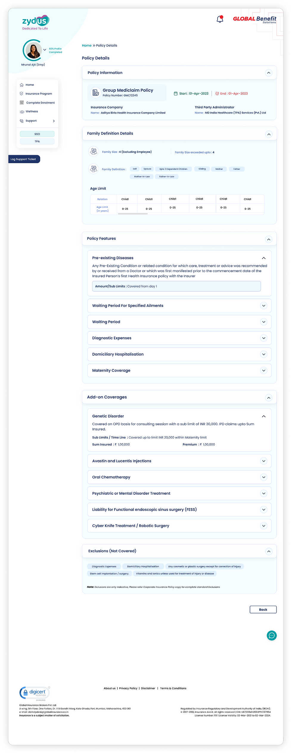
This section provides users with a clear overview of their policy details, including the sum insured, covered members, and quick access to important links. The design ensures key information is easily accessible, helping users stay informed and take necessary actions with ease.
Step 2 - Ideation
Sketches & Low-Fidelity Wireframes
.png)
.png)
Information Architecture & User Journey


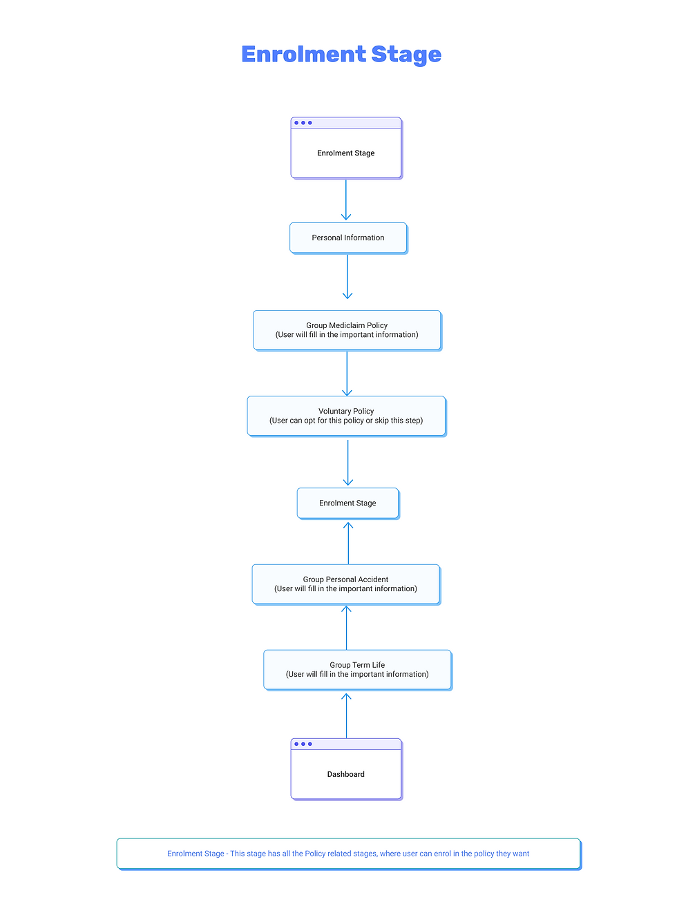
User Flow


Step 3 - Final Designs


App Designs
-
We decided to create an app because websites and apps serve different purposes, and we wanted to offer a more user-friendly experience.
-
Most people use their phones regularly, and an app allows for quicker, more efficient access to insurance services. With an app, users can easily manage their policies, track claims, and access resources on the go, all in one place.
-
It’s more convenient and accessible than using a website, allowing users to take action whenever they need it, anytime and anywhere.

Step 4 - Testing & Iteration
-
After finishing the initial design of the insurance dashboard, we focused on testing and improving it to make sure it works well for users. We conducted testing with a mix of stakeholders, including insurance experts and team members, to get feedback on how easy and useful the design is.
-
We carefully reviewed the feedback and made changes to fix any issues and improve the user experience. This ongoing process of testing and refining helped us make sure the design met user needs and expectations.
-
The testing phase was crucial in perfecting the design, ensuring it met both stakeholder goals and user satisfaction.

Importance of Research
Thorough research was the backbone of this project’s success. By deeply understanding the topic and user needs, we created a product that aligned perfectly with client expectations. It reinforced the importance of a strong research foundation in design
Reflection

Collaboration and Communication
Collaborating with developers and keeping the entire team informed ensured smooth execution. Regular updates and clear communication bridged the gap between design and development, resulting in a cohesive final product.

Staying calm, taking tasks one step at a time, and working closely with developers made challenges manageable. I also learned that asking for help and offering support fostered a positive and productive team dynamic.
Patience and Support
.png)


.png)